Picasso- Magic, Sex and Death

21st November 2014
In this lecture it was highlighted rather well to us that dates are just as important as the work itself, obviously the work will have a story behind it, whether it's the artist's background, thoughts, feelings, or just the overall era that it was produced all impact the outcome. Therefore the timing is important, and I feel this was very helpful in the overall lecture all of which could implicate into my own timeline.

Pablo Picasso- Mother 1896
As well as the timing being important, we reviewed the preconceptions of artists such as famous artist  Picasso, I visited the Picasso Museum in Paris and found it very interesting to observe the reactions of a variety of visitors, and I applied this in the lecture when discussing the preconceptions of Picasso. At first, the abstract elements of his work hits you accompanied by the vibrant use of colours, dependant on his feelings at the time.
I found it really interesting that Picasso had managed to break from traditional styles of portraiture that he had grown to know so well, his father being a skilled painter taught him from an early age, leading to a genetic skill in beautiful and intricate drawings and paintings. He had a vast skill of depth perception and spacial awareness in his work, intricacy and rich use of colour.
Picasso- Sitting Woman
However, his once realistic looking beautiful oil paintings soon adapted to brighter, more vibrant abstract pieces, that I believe that despite being a hundred years old, still look modern and contemporary to this day. Picasso began an adventure into 'drawing as a child and not like a child' I think it was demonstrated in the lecture of what Picasso really meant by this, there is no way that an adult can realistically draw like a child because our brain's are too developed to not be able to think intricately of the actions that were taken, therefore as much as we tried they'd look too thoughtful and organised.


Raphael Madonna- Tempi 1508
He created the aspect of feeling 'blue' in his pieces, since his strong feelings of sadness began to impact his work.
"I started to paint in blue when I learned of Casagema's death" - Pablo Picasso
Picasso- Mother and Child
The sheer impact of loss allowed the artist to express a new outcome of emotion through his paintings, adding another alteration to his work.

Old Guitarist- Picasso
Blue was once a colour used to represent purity, a rich colour that was hard to come by, was often used for pure characters like the Madonna. The blue period was a large part of his life, making his painting mirror his feelings.
Picasso- Guernica 
 Another emotional piece Picasso produced after fleeing from homeland Spain, was the aspect of the explosions and attacks in Guernica, which he decided to represent in this deep piece, again representing sad emotion with tones and grey and blues. Each piece of the painting representing a different thing.

Issues and Practices Lecture

24th October 2014
Today's lecture explored the ideas of perspective. What is considered a real art form? How can art movements impact a community?
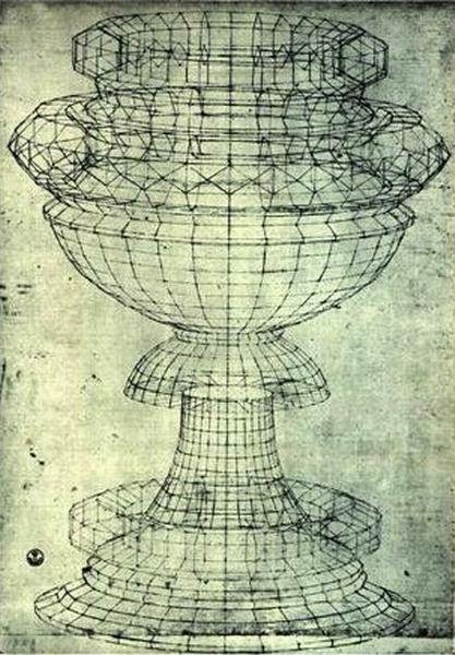
Perspective- Paolo Uccello 
Each movement reflects the time era of the chosen topic. The industrial revolution transpired into such movements as Cubism and the aspect of collage. (From the French coller- to glue)
In contrast such movements as the famous Dada movement, a movement that rebelled against known art conventions, transpiring from the first World War onwards. The aspect of things that may seem nonsense at first but within the perspective of the time made strong statements against the norm. Such movements completely contrasted with the usual perspective (such example as Paolo Uccello's 'Perspective' 1397-1475)
A famous act of the Dadaist rebellion is Marcel Duchamp's 'Fountain' 1917- a simple urinal made to represent art in an alternate form. It is visually strange and completely symbolic of the rebellious nature against society's considerations of normal behaviour and normal ideas of art.


Alternatively, Dadaism effected other medias, such as the Literature and Language stages of society, acts of Dadaist poems provided a rather random outcome of poetry, defining themselves against the considerations of everyday literary ideas.

Hannah Höch's work.
"One can shout with rubbish... Everything had broken down in any case, and new things had to be made out of the fragments"- Kurt Schwitters.
The aspect of randomly cutting up existing literary words and reassembling them by chosing at random words from a hat was a bizarre concept, with extremely bizarre outcomes. These poets were wild and free of society's restrictions during this time, they wanted to make a statement that anything can be altered, even society's art forms in every media.

Hannah Höch's Industrial Landscape 1967
How to make a Dada poem-

  1. Take a newspaper or book
  2. Grab some scissors
  3. Cut out all the words necessary
Female contribution to the movement also offered completely different perspectives, such things as the combinations between pornography and women's magazines was a key element produced mainly by female artist Linder Sterling and Hannah Höch.

Freeview Left Behinds- Singing Toys

I stumbled across this advertisement when watching TV in my spare time and found it quite fascinating, Rick had previously mentioned that in the industry they sometimes either combine stop motion and digital animation, and also imitate stop motion with digital animation. I found this point applied well to the idea of the 'Singing Toys' advert.
Credits List:
Project name: Left Behinds
Client: Owen Jenkinson, Head of Marketing, Freeview
Creative agency: Leo Burnett
Creatives: Rob Tenconi & Mark Franklin
Creative Directors: Richard Robinson/Graham Lakeland
Executive Creative Director: Justin Tindall
Agency TV Producer: Becky O’Sullivan
Planner (creative agency): Julia Chalfen
Client Service Director: Darren Thomas
Board Account Director: Ben Gillibrand
Senior Account Manager: Ali Wilde
Media agency: MEC
Planner (media agency): Michelle Radley
Production company: Rogue
Director: Sam Brown
Editor: James Rosen @ Final Cut
Post-production: Electric Theatre Collective
Audio post-production: Aaron Reynolds @ Wave
Exposure: TV, VOD, Online

Kinetic Verb Research

Tuesday 25th November 2014
After having caught up on the kinetic verb brief, I am currently researching into a word that I think will be effective.
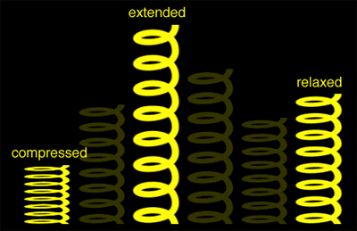
SPRING
The word spring I decided would be a good word to explore, the first build up of the word coiling back down to the ground and then springing upwards with both energy and tension. 

One of the first things I thought about when thinking about the energy of a bounce a spring makes is how these characteristics are applied to characters in a hyperbolic cartoon environment. The first instance of this became evident when I realised the character's connection to the word and an alternate outcome compared to the realism of kinetic physics. The character in question is 'Winnie the Pooh's Tigger, an energetic tiger character that springs up and down on its tail to travel, I found this interesting in the research of the word to see how different animators approach the characteristics of bouncing and springing.
Primary Research


'JUMP'

An additional idea was the idea for the word 'JUMP' with similar aspects of movement, but with less complex forms of behaviour, perhaps a better attempt for animating on the new software. I have learnt that the software itself can be challenging for new comers with complex words, so perhaps a research into this word itself will be more beneficial.
In first instances with jump I think of what does jump, primarily people, athletes, children etc, as well as some animalistic behaviour of jumping such as penguins and kangaroos etc. Obvious aspects have to be considered in order for this word to work out well, one of which is the aspect of weight, shape and size to be considered for the physics behind the animation. For example, a human's size and weight would be extremely impacting on the length and height of the jump. The same considerations I will have to make for this word, how high will it manage to get to? How can we further generate a hyperbolic sense without taking away the realism of the jump? Maybe an aspect of 'Squash & Stretch' could be used within the animation to produce an effect. I'm imagining the word crouching down with use of 'Anticipation' and then held for a few seconds, and then eventually built up into the full jump and then fall back down.

Physics In Motion

10th November 2014
In order for there to be realism within the physics of motion there has to be a considerable amount of thought into the physics behind it, even if it is so simple as a bouncing ball it needs to be just right in order to be realistic or plausible. The last thing a viewer wants is to feel uncomfortable watching something because they think it looks awful due to the lack of consideration of physics.
I personally would like to further study in my own time the physics because of the fact that there is probably a hell of a lot more of a theory behind it and more complex ideas too.

Differences in motion:
Fictional- Although all motion design concepts of cartoon etc. are fiction, do you want them to possess realistic physics? Most likely for such things as kids cartoons. Things will be emphasised more into more dramatic and almost humorous concepts.

Realism- Trying to capture the overall rules of physics within an animation is not only key to it's success, but it has to capture every quality in order to look realistic enough to be comfortable for the viewer.
 Certain considerations have to be made - do the wheels on a bus roll along the ground with the animator considering friction? How could the friction be altered with new materials? Going over rougher ground etc.

Stop Motion Exercises
Using stop motion animation, I cut out a circle for some exercises to imitate a ball bouncing etc. in order to do so I realised the following and this could be applied.
My first bounces were too sharp or the speed wasn't realistic enough, adding more of a bounce to it emphasises more of a cartoon perspective onto the design. Before producing the stop motion I applied my knowledge and imagination to the exercises - what material is used? how would they interact with each other? how could this be most effective?
To make it all smoothly run the movement had to be considered fully, the amount I moved the circle varied the speed of the roll etc.

17th November 2014
After Effects Exercises- 
Using similar exercises in After Effects, we tried some trial ideas first, the demo I found slightly challenging at first but then once we started the exercises it began to be more clear of what was most effective. Using such rules as making arcs etc.
I am looking forward to learning more on after effects and adapting these skills into further projects.

12 Rules of animation from Panop Koonwat on Vimeo.

Things You Notice

12th November 2014
The brief was re-examined in this case for a more broad review of motion. My ideas of motion were captured mostly in Paris, a place full of distraction and beauty so a perfect place to try to see things that aren't as obvious at first. Whilst most people swooned over the beauty of the Eiffel Tower and many other attractions, I tried to examine things that aren't as obvious such things as motion of traffic, motion of the crowds around them, the motion of the hustle and bustle of the city. I produced some gifs to enhance some of the movements that I managed to capture.
Simple aspects that maybe are overlooked by most who pass through the city, such as the maintenance of the streets etc.

Giacomo Balla
 Giacomo Balla was an artist that particularly stood out in the theme of capturing motion and noticing it too. The artist used his pieces to capture the essence of movement without actually allowing the piece to move. His blurred line usage and paint smudging techniques imitates the idea of movement, and the pace that the object is moving at. The blurred aspect particularly shows the speed of the motion, a technique that can be applied to animation such as on Adobe After Effects with the 'Motion Blur' tool, which applies a slight blur to  the music, creating an effective technique overall.

The way in which the movement happened was particularly beautiful in my opinion, the fact that instantly you can see exactly what he was trying to do especially in the featured painting of a dog running, showing the action and motion of the legs and tail. The aspect of colour is minimal in comparison to the bold forms of tone and black line, imitating the aspect of movement. I like the fact that an artist can sum up an idea of movement with not only a stationary form, but also a two dimensional aspect rather than a three dimensional form of animation.
 The more geometric the line forms become, the more and more abstract the pieces appear, but still withstanding the aspect of movement, forcing the viewer's eye across the page.


Seven Miles Out

Once taken to the destination of Seven Miles Out Courtyard in Stockport Old Town, I found certain elements of the place particularly interesting. Such elements I found most inspiring and interesting about the courtyard was the mess of line elements that seemed to weave through the urban decay of the building.
I noticed that throughout the entirety of collecting the pieces together of observing the courtyard in detail, there were a lot of implications of line within the compositions captured on photos as well as other rubbings etc.

Collected the following as documentation for representing the courtyard:


  • Screws and bolts
  • Pieces of brick and rubble
  • Pieces of wood
  • Rubbings from walls
  • Rubbings from floors
  • Sketches from around the area
  • Plant debris
  • A quick piece of descriptive writing I felt represented the courtyard's atmosphere and the lines I saw within it.

 Here's the following descriptive writing I constructed in the courtyard about the surrounding area as a different media to represent the surroundings.
Lines. Lines framing the very essence of the courtyard, the black webs of wire folding in and out of the rough tides of cement. A deep depth of eternal shadow, clinging to the frail cobwebs and broken bricks, wrapping its strength against the walls like a boa constrictor against desperate prey. A couple of lazy wires flap in possession of sloth like rhythm, warily wondering against the foundations they had once begun to constrict.

I felt that describing the courtyard in such a way really helped develop the feelings that I felt, almost as if the elements of the place were personified and brought to life.


10th November 2014
For the exhibition space we had to produce out of the fragments collected to represent the courtyard, I chose to compose my exhibition on an overturned table.
 I chose this set up as I decided that due to the line qualities I concentrated on and the intricate viewing that was taking place, I decided to imitate a forensic type of layout, with string connecting my fragments together as if in an investigation.
I framed the space with the fragments of rubbings from the ground, I wanted it to feel enclosed alike the feeling in the graveyard. One of my favourite photographs taken from the courtyard experience is the silhouette through the bars in the alleyway, as I feel this represented an ominous source of mystery which is perfect for the feeling of the courtyard. I placed this piece printed slightly off centre, to produce a slightly uncomfortable approach or to be quite intimidating (from the composition task, learnt skills of how to make the viewer feel alternate emotions through simple layout tactics)

Wasilly Kandinsky

Wasilly Kandinsky is an artist that I have found particularly inspiring in context lectures and I feel it could also be translated back to my past few months of experience with Motion Design.

Although these paintings that Kandinsky composes are stationary forms, I feel like metaphorically they are meant to be the opposite. To me, these pieces look extremely adventurous, lively and animated, anything but stationary paintings. The sheer aspect of line and shape itself is extremely effective with curvatures and straight lines representing alternate forms of movement, and that paired with the adventurous forms of colour is truly magnificent.
In a way, it reminds me of our project in which we had to use the shapes to represent the different words in compositions. Personally looking at Kandinsky's pieces I feel a sense of adventure and a euphoric energy about them.

Kandinsky was mythed to have a form of Synesthesia, where the senses are somewhat muddled. In Kandinsky's case, most of his pieces are supposedly composed to represent his confusion of being able to see sounds instead of hear them. After having heard this, I think it really shows the beauty of the work that Kandinsky produced, the colour and melodic shapes in a busy composition representing sound and pitch.
I love the abstract element of every piece, although all representing a similar feeling of sound in a series, each composition is completely unique and inviting.

Kandinsky once said -
Colour is the keyboard, the eyes are the harmonies, the soul is the piano with many strings. The artist is the hand that plays, touching one key or another, to cause vibrations in the soul.


John Lewis Christmas Advert - Monty the Penguin

I wanted to take a look into how animation impacted the advertising industry, starting with the overall  magical Christmas advert by John Lewis, an advert  that is currently going viral for its emotive use of a very cute penguin called Monty (CGI).
According to 'The Guardian' articles, the penguin trailer cost over £1million in CGI, in order for the penguin to capture the imagination and emotion of the viewer.
Personally I found that the advert successfully captured the essence of childhood imagination and the viewer's instantly empathising with the child in the advert along with the bond he has with this imaginary figure of a friend (later represented to actually be a toy penguin) the body language and overall actions of the penguin are entirely accurate and really represent the actions of a real penguin with added features such as more human actions (helping pick up building blocks etc)
Quoting from the Guardian:
The department store’s boss, Andy Street, may have pledged to keep the launch low-key, but the £7m campaign is once again bidding to be one of the media events of the year, encompassing a slick TV ad, a specially created smartphone app, story book, soft toys and in-store events including a chance for kids to see their toys brought to life with the aid of experimental gadgetry. 
(http://www.theguardian.com/business/2014/nov/06/john-lewis-unveils-christmas-ad-starring-monty-the-penguin)

Interacting the viewers more with the animation that now is well loved amongst the media and families is a launch of Monty the penguin toys and other merchandise.