Composition- Static

Monday 29th September 2014
Composition itself is the positioning of particular subjects to produce an alternate effect. During the opening briefing, it has been made clear that the composition of certain layouts can be altered and in doing so produces a whole new ambience.


The following words I have researched more thoroughly:


Euphoric
  • Tranquil- Circles, spirals, gentle curves. Amicable, balmy, calm, relaxed, laid back, chilled out, easygoing, placid, composed, sedate, serene.
  • Threatening- Sharp Angles, perhaps triangles and sharp edged shapes, pentagons etc. Other related words: dominant, aggressive, scowling, impending, bullying, terrorising, looming etc. Opposites include- far, remote, distant, peaceful
  • Uncomfortable- Curved edges, intruding shapes and patterns.
  • Euphoric- dreamy,
  • Heavy- block colours, weighty, powerful, tough
  • Precarious- unbalanced, on edge, uncertain
  • Tense- almost touching, close encounters
  • Overwhelmed- surrounded by objects, on top of you, crushing etc.
  • Secure- put in place, safe, lines, blocks.
  • Light- free, happy, spacial.
  • Claustrophobic-confined, stuck
  • Sedate- chilled out, tranquil, peaceful
Heavy
Claustrophobic
I found the overall aspect of these compositions quite challenging, the fact that I had to try to represent a word without illustrating a scene or picture was highly intimidating at first, but was later more of a comfortable choice to have made. I started to try to section out what shapes would benefit which word, allowing my imagination to be widened to what was the best overall composition for this brief. Understandably, I decided to think of simple ideas at first, as even through the briefing of the project I knew that the best way for me to achieve these words to start of with would be to introduce some simple ideas, simple shape forms and thickness of different lines. The aspect of the word 'Heavy' for example was one of the first pieces to be explored, I selected some of the larger and bolder shapes for this composition to first of all represent what I considered to symbollise heavy, I think that the first thing to spring to mind is the idea of boldness for the shape, in order to be heavy I wanted it to be a composition that was eye catching.
Light
Overwhelmed
Sedate
Shapes were just as important as lines in this compositional task, I keep trying to produce pieces where the lines secure the meaning such as the words like Tranquil where I am just using the wavy line, I'm liking the fact that the wavy line leads the eye across the page, showing that even the position of shapes can completely change a composition.
Secure
Precarious

Tense
Tranquil

Threatening
Uncomfortable


Light and Film Noir Workshop

Wednesday 24th September 2014
I've just been introduced via a Light workshop lecture to the aspect of Film Noir, using light to successfully produce an aspect of tone and drama. In such films, there was always the aspect of crime and thrill, so in partnership, the aspect of drama and suspense was added via light. As a starter to the workshop, we have been told to research further into the aspects of Film Noir, I found such aspects such as the silhouette contrast of light and shadow very interesting. We were shown examples of the following pieces:

  • Nosferatu 1922- Directed by F.W. Murnau - heavy shadows and the invention of fictional shadowed films.
  • Cabinet of Dr. Caligori 1920 - Dr. Robert Wiene (shadows painted onto set to emphasise further contrast)
  • The Grifters 1990
  • The Man Who Wasn't There- 2001
  • This Gun for Hire 1942
  • Blade Runner 1982
  • The Lady from Shanghai 1988
  • The Matrix 1999
  • Out of the Past 1947
Before the shoot commenced, we selected some printed images out of the group that we thought were the most effective, we had previously researched our own photos and gathered the ones that we thought we had the relevant props for. I personally brought some hats, a blazer and some ties in to contribute to the compositions, overall we had the following props- 

  • Blazers, a variety that different people brought in
  • Ties
  • An e-cig for smoke effects (water vapour only) 
  • Hats
  • Jewellery
  • Dresses
  • Fur coats
  • Guns
  • Whiskey glass
These props provided important tools in order to compose all of the film noir pieces. They were split amongst the two groups constructing the pieces. I think that the overall effect of the film Noir pieces is particularly inspiring to me, how can lighting be used in other ways? Perhaps in future animations or compositions, more consideration of lighting will be considered due to this workshop helping us with the planning.


Finishing Pixilation Title Sequence

Monday 22nd September 2014
We edited the colour balances and the speed to ensure that the clips worked well in synchronisation with each other. Using 'After Effects'  we edited the speed and colours of the selected clips, overlaying them so that they are side by side in order. We decided to ensure that the letters appeared one by one, ensuring that when we apply the sound effects to the animation in the future, the audio won't be merged into an ineffective noise.
To alter the white backgrounds we went to 'Effect' > 'Colour balance' and altered the tones of the white to ensure that the shapes of the letters appear brighter and more apparent.

This (shown left) is the overall 'Animate?' sequence edited on After Effects but produced on iStopMotion. I think that the overall impact of the sequence is very effective, and all the letters work very well together in synchronisation.

'Pride' Cornerhouse Manchester

Friday 19th September 2014
(Artwork found on wordpress.com) 
We went to the Cornerhouse in Manchester to review the film 'Pride' Directed by Matthew Warchus, starring Bill Nighy, Andrew Scott and Imelda Staunton. The production was a film exploring the aspect of Thatcherism based in 1984 during the Mining strikes when the government was run by the late Margaret Thatcher. Before viewing the film, we were allowed to tour around the exhibits of the Cornerhouse and get a real context of the building itself, I admire the cinema's traditional yet independent values, and the exhibits themed around the building too. We were handed a sheet describing the overall context of the film we were about to see, explaining the aspect of Thatchercism and the impact her rulings had on miners in the 80's.

Context of Thatchercism- (Sourced from internet as well as sheet given at Cornerhouse Manchester by Gary)-
Thatchercism makes up the ideology of former Conservative Primeminister Margaret Thatcher, whom elusively thrust her ideas onto the general public forcefully, the main rules being about the miners, thus leading to a long battle of miner strikes due to her very movements. The Miners Strike 1984-1985 began due to the unfair amount of coal mines that were forcefully shut down due to Thatcher's beliefs, producing an organised strike by the NUM (National Union of Mineworkers) The actual strike itself involved riots of thousands of miners and of the police trying to restrain them upon Thatcher's orders.

The film itself bases around a group of gay and lesbian activists, who decide to raise money for the miners on strike in that time, naming themselves the LGSM- (Lesbian and Gay Support the Miners) I think the way the film was constructed allowed a heartwarming sense of empowerment, making the audience feel a sense of empathy towards both the activists and the miners involved, producing a beautiful sense of teamwork and acts of passion. The fact that despite their differences, they were similar in more ways than they could imagine, forming an unlikely friendship between both groups due to the fact that they are both groups of people that are victimised for having certain beliefs and left to feel alone. I think the way in which this unlikely friendship was conveyed was very uplifting and powerful, especially alongside the symbolism that was inserted in the piece.

The film was first off based around the character Joe, who was soon to be nicknamed Bromley was in the opening shot, filmed at a birthday table with his parents, and soon rushes to a train to take him to London, opening up to a gay and lesbian parade, who he then meets the group of gay and lesbian activists that he will venture the film with.
The group pair up with a miner village in Wales, a complete contrast to their urban lifestyles, the rural idyllic landscape of Wales was home to a village who drastically needed financial support to ensure the families and the miners themselves wouldn't soon starve.
The miners have mixed views of their new vibrant guests, but are soon warmed up to the attitude and passion that LGSM soon display, encouraging hope in a village that is engulfed in fear and hate from Thatcher's actions with the government. I think it really embraces the fact that no matter what background people are from, or what their current state is, a single similarity and act of passion and courage can bring any group of people together, despite their variations of characteristics.

Warchus had clearly put a lot of thought into the production of such a heart warming film, the outfits relevant to the 1984's and the overall prejudice that would be present against individuals at that time (gay, lesbian, transvestite etc.) and the fact that Warchus had harmoniously paired up both politics and humour was a media gem. I personally normally find films that possess a political theme quite tedious and boring, but this film presented something for everyone, light hearted jokes but without removing the seriousness of the situation and overall reinforcing the importance of human generosity.


The handshake was a symbol of the miners
Symbollism- Throughout the film, the symbolism of hand in hand support was repeated throughout, the aspect of shaking hands/holding hands included the meaning of support 'you support me and I support you' The symbol was the main metaphorical background to the film, two alternate groups of people sticking together through a familiar discrimination of Thatcher, and working together to show their rights to freedom of speech.


16mm Filmstrip

Monday 17th September 2014
After being given the brief for the 16mm Filmstrip Project, we were shown the animations of Len Lye and Norman McClaren due to the way the colours and patterns were so intricately choreographed together.

This video clip by Norman McLaren, 'Begone Dull Care' 1949- is one I admire due to the intricacy of this production, especially with the overlay of film that was used in the feature to provide a melodic combination of patterns. Applying music overlaying the film was beautiful.
After having watched the following of Norman McLaren's pieces, I felt truly inspired to produce work of a similar sense, in that it would also inherit an aspect of rhythm and choreography, allowing the patterns and forms of lines to interact with the music.


I'd collected the following materials to scrape and scratch as well as colour onto the film:

  • Segments of sponge- Norman McLaren and Len Lye used a lot of sponge work to produce alternate textures that couldn't be achieved simply by using a paintbrush.
  • Nails and screws- offer a sharp tip to scrape and scratch into the film's surface, producing a more intricate form of line depth and texture.
  • Scissors- Offer a thicker point for scratching into the film which could then allow more light through once captured.
  • A colour palette- allowed me to mix my own colours together without cross contaminating the pigment dyes.
  • Drawing pins- produced a finer line definition with scratching into the film.
  • Scalpel- a bolder, more definite line could be achieved by scraping the scalpel into the film efficiently. 
  • Pigment dyes- offered a vibrant variety of colours in alternate line forms and patterns.
  • Paint brushes- alternate shapes and sizes to produce different forms of colour and patterns.
I'm allowing the dye to mix together to produce different gradients of colour, my first strip I didn't put too much structural consideration into the colours and patterns as a test, but then on my second strip, I'm thinking of perhaps having more structure to try to imitate an aspect of rhythm that I wanted to achieve for so long.
Finally I have completed the overall 2 filmstrips, I like the depth of tone and colour that I have achieved by coincidence in some cases. The fine lines that appear on the film are a lot deeper than I imagined, but successfully enforce an aspect of rhythm that I wanted to use due to the inspiration of Norman McLaren and Len Lye. I have included some research on Norman McLaren in my sketchbook.
My thoughts after completing the overall pieces is what audio could be added? Could I transform the debris of the filmstrip production into it's own animation? How would this create it's own composition? I found the production of the piece quite interesting to see how the film looks underneath the microscope camera, and how close up and vibrant the patterns and colours appear due to it.
I've started to produce a stop motion effect on the left over marks made on paper from the filmstrip by using the same technique but with the paper instead of film. The overall composition I found quite easy to create with the paper and film, but I do have a newfound appreciation of the skill that McLaren inherits for the films he creates to resemble the music that he was representing, especially as I know for a fact that he didn't get the technology of iStopMotion, and had one chance to show it as the projector could've easily 'eaten up' his film.


BIG BANG BOOM- by Blu

I've recently noticed this beautifully intricate form of Pixilation by a Street Artist named 'Blu'. I find it admirable the way in which the thought has gone into the representation of the dinosaurs and other animals using alternatively produced forms of pixilation. Using stop motion technology, the artist has used graffiti art in a way that breaks the boundaries of realism. The abstract components of the moving characters produce a surreal world that wouldn't normally be captured on film without the Pixilation technique itself.

Manchester Art Gallery

 Friday 12th September 2014

We ventured out to Manchester Art Gallery to study the exhibition that was taken place, we were told to allow independently our inspirations take hold, taking notes of any pieces that particularly stood out to us, listing the title of the pieces and why they interest us. I found it quite relaxing and inspiring looking through the exhibition but with extra analysis that wouldn't normally take place in a passive format. I liked the freedom of the choice of our own pieces, allowing us to pick and decide what pieces are the most effective, meaning that the ones I selected were a variety of media, both 2 and 3 dimensional pieces. We were told to select a few that interested us, and one main piece that we found the most inspiring. 

Euston Steps- Frank Auerbach- 1980-81
The first piece to attract my attention was this piece by Frank Auerbach, the first things about it was the fact that despite only being simple marks, from a distance they resemble a complex scene. The layers of paint were applied like impasto, instead of removing the layers of oil paint he wasn't happy with, Auerbach painted thicker layers to cover it. I found the way in which the aspects of lines resemble the scene work well together.The way the colours worked together despite not really having a theme also seemed inspiring to me, finding the overall composition extremely effective.

The Chariot Race- Alexander Von Wagner 1882
This large piece attracted my attention due to the pure intricacy of the design, featuring a scene of gladiators racing horses in a Colosseum, with additional detail added to even the audience's facial features. I like the way that Wagner has captured the action and adventure of this historical scene, due to the date of the piece, it is clear the painter was not present at any event such as this, but yet managed to capture the event in such beautiful detail, I find it very inspiring that Wagner has managed to successfully capture the action of the scene without even being in that era.

Homer- about 1800-3- William Blake 1757-1827
I found this piece caught my attention due to the detail and contrasts in white and blue tones, looking extremely effective as a whole I like the way the greek figure (Greek poet Homer) and the media used looked effective with the neutral tones shining through. I like the fact that Blake always paints his fellow poets, suggesting that perhaps Homer is his muse, inspiring his own poetry, like society's celebrities.

Porca Miseria! Chandelir 2004- Designed and Constructed by Ingo Mailner
This 3D piece really drew my eye in, as it used objects that would be used in everyday life, to represent a chandlier, which I think was a beautiful construction, and was elevated in such a beautiful and intricate way.  The way the objects were elevated casting interesting shadows, almost like an elevated explosion.
I like the fact that Ingo represents that any objects can be manipulated into representing something else entirely.

My Favourite Piece
A Spate in the Highlands 1866- Peter Graham
This piece was ultimately my favourite, not just for the representation of a landscape in the Highlands, or the use of negative space and muddy tones, but the fact that the landscape was so well thought out to match the famous poem by Robert Burns that the piece is actually based on. (Afton Water- Robert Burns) 
'Flow gently, sweet Afton, among thy green braes, Flow gently, I'll sing thee a song in thy praise; My Mary's asleep by thy murmuring stream, Flow gently, sweet Afton, disturb not her dream.'
(http://www.scottishpoetrylibrary.org.uk/poetry/poems/afton-water)
 I feel that the whole effect of making a melodic piece in honour of a poet was a beautiful collaboration. I found myself looking at the piece for a long while and peering into the centre where the river is flowing, and it very much has a three dimensional aspect to it, with the exploration of colour and tonal depth.
 

Introducing Context

 Friday 5th September 2014

To begin our context lectures, we were given an introduction that I personally found quite inspiring, watching a video of a talk given by a man who I found particularly inspiring in the way he spoke of society.

Group Pixilation Task

Monday 8th September 2014 
Seasons in Motion
After having made plenty of plans of ideas we could potentially undergo in the start of this project, we decided on the idea of a person being implicated by the seasons. Initially, we had the following main ideas, after having highlighted the most preferred: 
  • A person being bored in class, looking at his/her watch to in boredom, and skipping the hands forward an hour and the surrounding landscape changes around them. 
  • A person walking through a street and the landscape experiencing changes around them, seasons and weather changing constantly as they walk by. 
  • A fan covering a face of a person, and revealing alternate people as it moves along. Therefore including a variety of faces and roles.
  • Writing our names in a variety of materials or the title 'Animate?' being presented as such.
Throughout the planning of such ideas, we came to the conclusion that the idea of time travel that would be effective and is used in a lot of on screen films, would be too time consuming and intricate for the first step of the project, but we did like the idea of the surroundings changing around the person whilst the person was stationary. 
In contrast to this, we loved the idea of the changing faces, but decided that this didn't compare in interest to the intricate and more vibrant idea of changing seasons that really appealed to us all. 

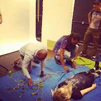
After having studied Pixilation and using videos as sources of inspiration, we particularly liked the technique involved in 'Sorry I'm Late' by Tomas Mankovsky by using gravity as an advantage in filming by filming the main character lying down. Therefore we decided to have the subject as a female character that remains stationary as the seasons change around her (chosen female due to the interesting movements that could be captured through the hair) We decided on the following props for each season, all of which would be displayed on a set we prepared ourselves. 
Before actually going to the studio to film the production of the Pixilation, we first of all planned out the set and the size of the actress involved by aligning the materials together on the floor, as a rehearsal for the studio filming. This allowed us to establish the proportions and positioning of certain props and their importance in the shots. 

Certain members of our team were left in charge of certain props, to collect the setting:

Rachel & I- In charge of looking for a fabric sky, needed to be a large scale, also some fabric for trees or the land to stand on. 
Jamie & Steph- Went to the park to collect leaves and sticks for the construction of the tree.
Nayeem & Olivier- Collected aspects to represent the clouds, polystyrene and white materials. 
Daniel & Sam- Made the sun and the rays out of yellow card, and some strands of rain if needed.


Spring- 

-Sun made out of yellow card- cut out as a simple shape form to capture a simplistic element- Sun controlled by Daniel and Olivier during the shots of Spring, Summer and Autumn.  
-Flowers- growing slowly out of the ground to show the growth of spring - Prop roles of the flowers shared amongst us all, but main roles included the lego flowers (which I controlled), and the surrounding flowers by Nayeem and Sam. Jamie controlled the tree and leaves in the breeze.
-Cloud- slowly moving over the sun and away- Controlled by Daniel and Olivier
-Birds- constructed with simplistic resources such as lego. Controlled by Steph, made to match the behaviour of real birds, fluttering around.
-Hair- I controlled to try to mimic a breeze and the nest in hair.

We wanted Spring to represent the growth and slight beginning of the seasons and the film, so the sun dwindling behind the clouds, and the flowers slowly growing from the undergrowth. We also wanted to represent such growth via the growing of the wildlife such as the birds, flying across the set and onto the tree, but in the meantime we liked the idea of making the birds interact with the character, thus, making Rachel's hair interact with the presence of the birds by making it into a nest. I liked how this idea embraced the true nature of Pixilation by achieving the impossible in terms of realism, and making abstract elements reality through stop motion. During each frame, I moved the strands of hair slowly, as if to mimic a slight breeze blowing past the character, which would then produce the desired bird nest design. 
In order for the aspect of Spring to be captured, we wanted intricate details to be included, we decided to feature the birds flying above the character's head, with twigs to place in 'the nest' of her hair, in order to be quite cinematic, we allowed the actor (Rachel) to interact with the birds, with such behaviour as facial expressions (shocked, happy) and crouching, which allowed the actor to position her legs to appear she was crouching whilst stood up, trying to get away from the birds. Other features included her hoody being taken off from the actor, which also adds the beauty of Pixilation, making it look like she has special powers by removing it on its on accord. We assigned one person (which alternated per Season) to keep an eye on continuity, ensuring that everything was kept in frame that needed to be, and ensuring that the props were moving at the correct paces.

Summer-

-Sunglasses (a large proportioned pair for comical value) Controlled by Daniel and Sam, blutacked to the set at one point to defy gravity.
-Extra flowers (constructed from lego, as well as extra flower props) Flowers controlled by myself and Sam.
-Leaves- Controlled by Steph, and exit of birds also by Steph
-Hair- Controlled by myself
-Sun (same as used for spring, but movements more energetic for the Summer sunshine) Controlled by Olivier, whilst Daniel ensured continuity was withheld throughout.
-Sunhat- appears in frame Controlled by Nayeem and Sam.
-Leggings roll up by themselves. Controlled by Sam and myself.

Summer is one of the most vibrant seasons, and we wanted the set and props to successfully represent this, such props as the sunhat and sunglasses were two main components of the Summer era we wanted to convey. We liked to combine some inspiration from the ideas we came up with at the start (one original idea where the faces of the actor change when their hands wipe across) so we decided that the actor in this Pixilation, should wipe her hands across her face to reveal the sunglasses underneath. This takes perfect advantage of the Pixilation process, and looks extremely effective in conclusion to this. 
The transition of props was well thought out in this animation, we liked the idea of interpreting the wind into it from Spring, to carry the sunhat onto set, and onto the actor's head, I personally believe this was the right decision, as the whole impact was showing a development of the interaction of the weather and the textures that surround it. We also wanted to capture that Summer is quite suddenly upon you, so decided to make the little red lego flowers seem to pop out of nowhere, I was in charge of the lego flowers, adding them into every couple of shots, to make them appear to be popping out of nowhere. I also controlled the flowers, making them move across the screen and stay in place, and then scuttle off the frame over the character, giving them a lifelike image, almost impersonating an animal. 

Autumn- 

-Coat- to convey the sudden appearance of cold weather- Added onto character by Sam
-Sun- lower sun rays, shows dwelling of the sunshine- Controlled by Daniel and Olivier
-Leaves- slowly falling off the trees, dead leaves collected earlier added. -Controlled by Steph and Jamie
-Umbrella- to end shot and blow into frame- Controlled by Nayeem and Sam
-Hair- In a wild breeze to show the cold air - Controlled by myself and Sam
-Cloud- Still coming in to represent the rainclouds- Controlled by Jamie and Olivier

Autumn was the last Season we had time to do in the end, but the original plan worked out in the fact that there was an element of clouds and rain, with the umbrella swirling into the camera to end the scene. The coat wraps around the Rachel as she gets cold (again expressing this in a very theatrical way) and then along comes the breeze, effectively whipping the umbrella into scene, and eventually out of the frame and outwards towards the camera, producing an alternate dimension to the piece.
I think a key element of this Season was the breeze added effectively, through the melodic movement of the trees and hair of Rachel, that makes it appear to contain weather and the gravity of Rachel stood up instead of lying down.

Winter- 

-Coat
-Hat
-Scarf
-Snow
-Clouds
We were planning to produce the final season, but we didn't have time to compose the whole thing, the idea would have been for the umbrella from the Autumn scene to hide the change in scenery through Pixilation, and reveal a snowy scene underneath, with hat and scarf to join with the overall effect. However, even though we didn't manage to complete the final season, I believe it was still a successful outcome, and a thorough experiment into our first attempt at Pixilation.


Our final outcome- 


First day on the course! from BA (Hons) Motion Design on Vimeo.

Monday 15th September 2014
Let's Title- 'Animate?' 

As a second part in trying to experiment with Pixilation, we decided to as a group produce a series of letters that make up the title sequence 'Animate?' each being given a letter to produce and a way in which to produce it. We liked the aspect of the material to appear to be coming out of the finger of the person involved, through the aspect of Pixilation. To begin with, we were going to produce a composition including our own names, but realised ultimately this would be too time consuming, and it would be more texturally effective to experiment with alternate compositions of letters. We considered the following materials, (chosen ones highlighted below) :


  • Nails in wood 
  • Masking Tape
  • Pencil/Pen drawing with finger
  • Plastercine
  • Taking a letter from an existing object and placing it on an existing page. (Grabbing a letter from someone's t-shirt and placing it on a page from it)
  • String
  • Cutting a letter out of paper with a scalpel and placing it on a page.
  • Paint splatters
  • Staples coming from the point of the fingers
  • Snake (the game) characters being captured
We decided that the best way to construct these letters together was to have a letter each, we sectioned these out into a group chat.

A- Sam - Drawing
N- Rachel - Cutting
I- Nayeem - Plastercine (snake idea)
M- Olivier - Nails in wood
A- Me - Tape
T- Steph - Staples
E- Daniel - Taking a letter from an existing object
?-  Jamie - String

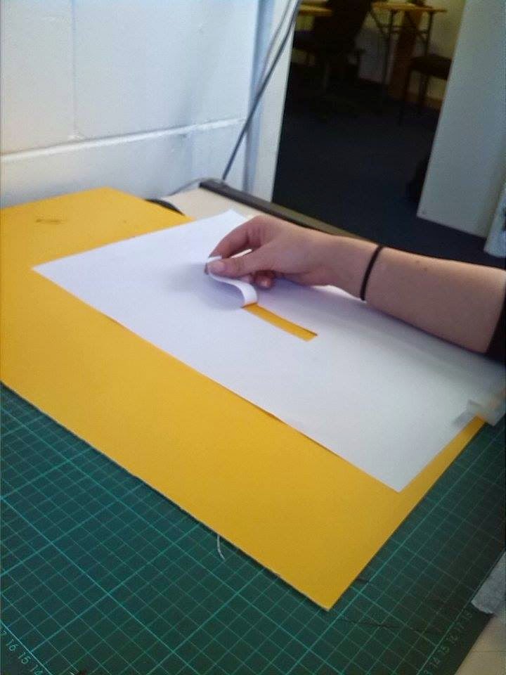
Rachel & I sectioned off into a pair to assist each other's pieces. Rachel was concentrating on an 'n', cutting it out into paper, with a coloured card lay underneath to reveal when it's cut out.

She used a cutting mat, scalpel, yellow coloured card, and paper alongside the technology of the iStop Motion programme to film the piece. First of all, she mapped out a template of the letter lightly in pencil, we placed the lighting equipment onto the page so that the template that Rachel was working from was virtually invisible on camera, thus, allowing Rachel's cut out pixilation to work accurately and professionally.
Lining up the piece of paper to the camera accordingly, we began filming the piece, her slowly cutting out the letter bit by bit, and placing her finger to appear to be cutting the paper itself. The power of pixilation made the slow process of cutting out and applying her hand back on top to capture the frame, became a smooth transition of an animation.
We plan to edit the pieces together in order to produce the title sequence 'Animate?' So we exported the file onto a USB and continued with my letter.
For my tape letter of an 'A', we decided that the letter and material used for it required a bigger piece of paper, so I used an A1 piece of card, and drew on the template around it. Due to previous testing, we decided that the best thing to do would be to use red electrical tape, as this proved to be the best and camera in comparison to such materials like masking tape. Setting the camera facing downwards facing the floor, we decided to include part of my head and hands in set, as it added some character to the Pixilation and decided it looked quite effective. Measuring up some prototypes of the letter beforehand in my Sketchbook ensured that the tape was used in an effective way. I decided to slightly crumple the tape as I pressed it down, as well as ensuring the edges were still crisp and neat. Again, we then intended to use this in the title sequence, so exported it on USB for the animation editing later next week.
This is the overall title sequence with the featured Seasons in Pixilation.

Sorry I'm Late- Tomas Mankovsky

Whilst conveying some research into pixilation I stumbled across this Tomas Mankovsky short film 'Sorry I'm Late' which I found particularly inspiring due to the elements of using simple objects to represent alternate forms (parasol for hot air balloon, cushions for ground etc.) Another element I found particularly inspiring is the whole implication of using objects in close up settings to represent larger forms (bonsai tree placed closer to camera to represent a full sized tree) as it was well composed and had a successful outcome overall.
Using gravity as a simple advantage for the impossible such as riding a bike to such lengths and flying etc, is a key element for Mankovsky to have included. The manipulation of the objects produces a successful outcome as it produces an abstract setting for the piece.

Western Spaghetti- PES

This pixilation for me is extremely effective, breaking the boundaries of what we consider to be 'normal' cooking ingredients and producing an abstract representation of this through alternate objects, such as Rubik cubes and knitting wool to represent the format of spaghetti. PES uses significant objects such as dice in a few of his pieces, all altering the purpose of what the object is originally created for.

I personally like the fact that PES applied the characteristics of original ingredients of spaghetti and applied them to potential objects. It's made clear that a considerable amount of thought has been put into the choice of objects, with the pin cushions resembling tomatoes etc. The way the objects interacted with the organic objects that he kept the same through cooking (pans and spoons that would normally be used) was part of the overall success in my opinion, such as having the sticky notes melt like butter, and the Rubik cubes sliced into smaller pieces.