Cubs Studio- London
http://www.cubstudio.com/portfolio/
When finding studios, I came across this Animation and Motion Graphics Studio based in London, they pride themselves on keeping up with the times, tracking softwares and technologies that best equip their outcomes.
The studio produces a wide range of animations, whether they're info graphic
s, advertisements or general animation stories, they like to produce colourful and dynamic animations, mostly in 2D. They generally use quite simple shapes and colours, which adds a nice futuristic feel, and also seems to resemble a familiar style within each, linking back to our discussion forum on style and trends. Cubs ensures that despite the range of work they produce, there is still an aspect of style that can be recognised over the pieces effectively. I personally feel this is a good trait for the studio to have as it gathers a recognition and further client interest.
For me, I've found this studio particularly interesting with the range of colours and textures added into the animations, I'd like to explore their work further in the future, as I've looked into their show reel and online portfolio.
Looking at the portfolio makes you realise how important it is to explore your online presence as they mentioned that the internet was key to their success.
Cub Studio 2016 Showreel from Cub Studio on Vimeo.
We have been given our discussion forum for the Identity of Motion Design to research into the aspects of Motion Design and why there is confusion as to how it is defined and recognised in certain areas. Rachel and I have discussed that firsthand we personally feel we have to discuss and explain what we are studying to other people as when presenting that we study Motion Design to the general public they don't understand what we mean by it, therefore we find we have to compare ourselves to graphic designers and animators in order to elaborate on our course and get them to understand. Therefore we'd like to start discussion on how we compare ourselves to other designers and where the lines between them are.
We've looked into what classes as Motion Design, and how this is different from Visual Effects and Animation.
The Language of Motion
"Adding motion to the mix doesn't simply broaden the skillset of graphic designers, it redefines it. Photography becomes cinematography. Illustration becomes animation. Even the essential skill of layout morphs into something else, something more akin to understanding the rhythmic structures of music than the solid forms of print. Motion design is, in other words, a new language. And designers have only just begun to test the limits of its expressive power."
When researching for my PDP I came across a website (http://blog.digitaltutors.com/10-essential-skills-need-motion-designer/) that elaborated on what skills and things you'd need in order to be a Motion Designer. The blog goes into the range of things that they as people in the industry believe you need to have experience of in order to be successful, and gave relevant examples of such things according to these things. Elements that have been included within the blog list are:
Graphic Design Skills-In order to produce high quality products and work, a knowledge of graphics as well as skills within it are pointed out on the blog. I agree that graphic design is a core element to our course and therefore needs to be a skill based around the animation. Due to the graphics being a huge part of the Motion Graphic Design course, it's also important to study what else is out there in terms of trends, competition etc.
Traditional Art Skills- Some work that will be produced does need initial plans, sketches and drawings. In order to actually get your idea across to a client or a storyboard artist, they must first understand the concept of what your idea is, and this can be helped with visual aids that can be easily developed by pre-existing traditional art skills. In addition I believe knowledge of art medias and history allows further insight in the best way to carry out a creative task.
An Understanding of Animation- Pretty self explanatory really, but the blog entails how the animations can be applied to new ideas, and the fact that different medias can be produced from existing materials or made ones through art production. An important highlight for this is the animation principles that are something that need to be familiarised with in order for success.
3D Design Skills- Due to the expansion of technology 3D is something in the height of popularity and therefore should be attempted or mastered in order for some sort of success, it shows variety and durability as well as showing that you're flexible with your medias so can have a wide range of outcomes.
Colour Theory- Colour theory is an important aspect of any design form, as it allows the designer to make visual decisions as to what works. As well as this, it's important for the designers to be able to pick up on colour decisions that will not work aesthetically such as red font on a green background or visa versa as these are an issue for colour blind etc. It also applies to what mood you want your piece to produce, with knowledge of cool tones and warm tones this helps to analyse what is an appropriate colour choice.
Typography Skills- From a range of serifs and kerning, it's important as a designer to know the aesthetics and meaning behind text and font as well as reasoning behind using certain typography to represent alternate things. The blog speaks about the importance of getting the right typeface as this can implicate your whole design and make it work or not.
Creative Thinking-
Technical Skills- Throughout our careers software will be constantly evolving and changing, so there's no way we can learn everything at once, however, it's important to have knowledge of a range of softwares as well as a range of methods to ensure there is variety and confidence in our work. Some softwares although different resemble each other, therefore getting to know certain softwares will assist the using of others.
Interpersonal Communication- Ensuring a good relationship with your client or creative director ensures the work is being carried out effectively and efficiently within the time and allows communication for amendments and adjustments to take place without dispute.
Originality-As hard as it is to be original, the blog speaks of how important it is to try to carry out your own creativity and reflect your own style within your work, in order to attempt to make a refreshing piece of work rather than a regurgitated piece.
I think it's important to assess such things in order to know what would be expected of you within the industry as well as allowing these skills to fall into place in terms of practice.
Should Designers have to work for free, or should they be paid?
Steph and Jamie began a discussion forum on the aspect of having to be paid as a designer starting off in the industry, and where it should be acceptable to work for free. Overall they discussed the aspects of free pitching, internships, volunteering and work placements and how these could effect your career overall. Rachel brought up the fact that it is best to show that you are willing to work for free, as this will help to supply experience for your CV, as well as ensuring reputation.
In the discussion we all agreed on the aspect that volunteer work is an important aspect of gathering experience and reputation, and indeed in some internships this may be necessary. We additionally discussed the aspect of free pitching, where clients will bring in a range of designers and ask them to pitch an idea, but they do not get paid for the pitch, and therefore can be faltered by this. They showed us a video clip that showed the aspect of free pitching being applied to other scenarios, and showed how ridiculous it would be for any other business, however, we couldn't conclude how else we would personally alter this system, as clients want to know what they are getting before they invest. The video includes an actor going into a sandwich shop and asking to taste the sandwich before he eats it, applying the aspect of free pitching to another business. This clip was helpful in ensuring that Steph and Jamie's points were reinforced.
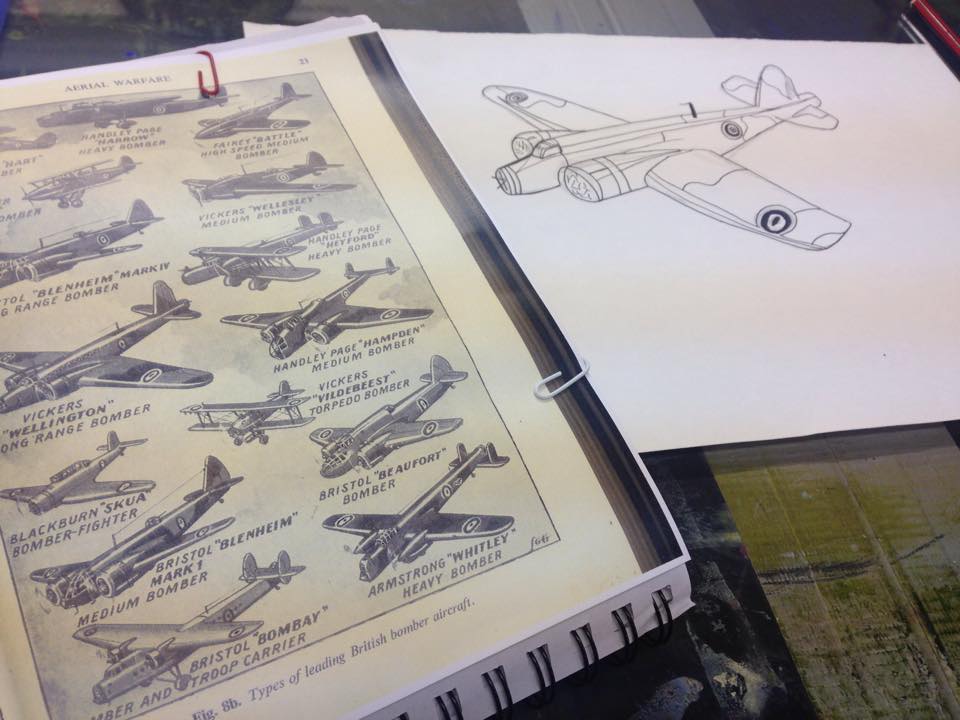
"They'd conducted a funeral service and were asked if they would go and fly over the sea in the Wellington Bomber and drop his ashes over the sea."
As a direct response to the audio, I knew from the World War II image at the start of one of the books that gave me inspiration, that I wanted to animate in the same style. In order to line up with the style of the image, Rick pointed out the fact that the piece is most likely some form of monoprinting, and therefore a technique I could experiment with. Monoprinting is a technique I personally haven't explored in full so it would be good to explore this technique further and perhaps even produce the whole animation in such a way if the experimentation itself is successful enough.
I intend to use Photoshop to then alter the print to match the colour scheme and general theme of the rest of the World War II composition. Monoprinting Due to me having limited experience with mono printing as I've never properly carried it out in such an illustrative way before, I requested a demonstration from my friend Luca, a L5 Illustration Student who provided a lot of insight into how to best replicate the technique, and allowed me to capture the visual elements needed for the story to be told. To be moving in synchronisation with the movements from the opening scene of the illustration, I wanted to replicate the appearance of the Wellington Bomber plane that is spoken about in the story. I think also having this opening scene allows a nice steady beginning to the story and really sets the scene for the animation's theme. An important aspect was to ensure that my mono print matched up to the existing images around it, even if it's for a small duration of time. I chose to use a shade of blue for the mono printing, not starting with planes, but instead with alternate line elements to see what best worked out. I tried the aspects of pencil, fine liner, biro and pencil crayon to see which applied the most pressure consecutively on the paper to produce a nice clear mono print. To begin with, after having produced a range of experimental pieces with the mono printing technique, I began sketching a Wellington Bomber freehand based on an illustration in one of the old war books I had collected in my research stages. To print the plane on the paper then with mono printing, I used biro to sketch in the tonal areas and added a reasonable amount of pressure for the lines around it, this produced the amount of shading necessary to add print from the ink around it, allowing a tonal aspect that is already existing on the other illustrations that it needed to fit in with. There are certain aspects of mono printing that I learnt that could be altered if I were to do the technique in future, due to you adding pressure in order to produce a print, I had to ensure my hand didn't lean on the page, therefore the drawing wasn't as detailed as it could've been and therefore the print didn't have realistic details. However, for the aspect of the theme of war and the fact that it needed to match with the rest of the images, this outcome is perfect to edit into the composition.
After having produced a wide range of alternate outcomes to play with on Photoshop, I am overall happy with the outcome, and will experiment this further and see if the mono printing technique successfully matches up to the technique used in the original composition.
Editing the Monoprint
After having completed the Wellington Bomber prints, I picked out the one I felt successfully captured the aspect and theme of the original composition that I am using. Using the colour match tools and filters on Photoshop, I matched up the elements of the composition to that of the print to ensure that they work well together. Overall I was happy with the end result, as I feel it successfully fits in well with the remainder of the composition. Using a cut out as well as a background of the plane, and using Photoshop to edit the background textures into clouds, I could then have the elements to make the plane look like it's travelling through the air whilst the audio is telling the story.
When editing the mono print into After Effects, I ensured that I asked for feedback from my peers as well as people who hadn't already heard the audio as this supplied a new train of thought as I needed to make sure that the story was being successfully illustrated to the audience.
Within the group we visited Manchester to visit the alternate studios and agencies that are there, I felt this successfully allowed us to have a personal insight into studios by not only viewing what they do online but actually interacting and witnessing the designers in their studios and natural backgrounds. They also supplied us with some sound advice on how to begin working, and how exploring different medias and projects begins with experimentation and just trying new things.
Our first visit was to 'The Neighbourhood' a studio that describe themselves more as a "Creative Communications Agency" On joining the studio, it was obvious that they offer a diverse range of media elements, and they stated the fact that they like doing the "meaty" section of work, with directly working and collaborating with the client instead of a restricted given piece to produce. This means that they can work with more adventurous creativity rather than being restricted by certain requirements.
Haatch- an informative 2D video
As well as producing a range of Graphic Design posters and branding designers, they're also working with Architecture and with some Moving Image work. They showed us a range of work that they produced, showing us the diverse amount of work they make such as things for exhibitions and installations.
Through the course of their introductions and speech to us all about the work they do, they showed us some of their work that they have produced one of which is the JD Sports Christmas campaign, a visual piece for advertisements, for billboards, advert posters and television. They spoke to us about their close collaboration with the commercial CEO of JD Sports, and how that they had specifically asked to use a Manchester based company rather than a London based one for a more Northern based choice. JD have previously used London designers but apparently they weren't able to collaborate closely with them and therefore didn't get the result they wanted or asked for.
There are 3 different sorts of footage that add up to an overall ad for television. This example is the juniors section of the JD range, adopted with the pixelated game style cubes surrounding the actor. Also part of the range, there is the women's and men's sections, the designers said that they'd applied alternate styles but still the same theme to ensure that they looked like they were for the same series but still reflected the audience in each.
Each segment of the advertisement included a snow scene with geometric and simplistic background, a futuristic look to match the client's requirements for the ad to seem 'cool' and 'edgy'. Women's- Same sort of music as in all 3, however has more curvaceous background shapes, circular, curved edges to add a feminine sort of edge to the advert, also replicated in the posters supplied for JD. Men's- Again keeping with the same theme of music throughout to ensure it still replicates the series, the men's has more rugged square and oblong shapes for a more masculine edge to the design. Juniors- As mentioned prior to this, the designers and client agreed to use some pixelated, game like shapes to appeal to a younger audience as well as different camera angles to keep it mixed and edgy.
As well as sharing the pros with us on such work, and sharing their pride in the work they have produced, they also shared with us the stress that may have developed and the fact that it had to be a full group job, where most of their designers (about 32 and freelancers) had to help at some point due to the mass size of the job. They also discussed the aspect of pitching the ideas they'd come up with to the client, and how process of thought and elimination are equally as important, they initially were going to use animals in the ads but the clients disagreed etc. all adding to the main components in the final advert, to ensure that they all were in agreement before adding to the design, ensuring client approval and satisfaction. To help pitch ideas, they discussed how they each make quick sketches of their ideas, however for the client they bring in professional storyboard illustrators who produce a professional looking storyboard that the client will most likely understand more than the initial sketches.
The background elements were added in with a green screen, although the actors when filming were also stood on white podiums that were then developed into platforms in the adverts. The aspects of snow were also added in, they discussed that they were going to use physical real aspects of prosthetic snow and throw it over the actors however they said this was proven too hard to control via editing the series.
Centre Screen Productions was the second design studio we visited, a more established design firm, they produce a vast amount of historical animations and interactive design work for museums, exhibitions, events etc around the world. A leading multimedia company, they strive to produce both visual and audio interactions for a wide range of venues. The collage aspects of some of the company's work appealed to me, particularly with the current project that we are studying with me doing my Story about my Great Grandfather through the aspect of collage animation.
The company specialises in more installation type work, which I also withhold an interest in as these installations supply a different mood and feel to an event, such as in a museum, exhibition or performance.
When visiting the studio, they pointed out the struggle that designers, especially with the multimedia aspects that they specialise in, have to keep advanced and with the times i
n order for successful outcomes. They pointed out their past struggle with the quick advancing technology, as they produced interactive app like technology before the touch screen phones etc. were produced, once corporations like Apple came along, it was harder to determine how they could make such animations more appealing.