Synopsis of Gathered Texts

Looking for references for the keyword of 'Silence' has been difficult in order to find relevant references, but using a range of resources I have gathered a list of publications and texts I have looked into and would like to read a bit further into if I can access them more. Here's my small synopsis of what I thought each text was trying to get across:

(Google Scholar) Reference 1.
'Emotion & The Structure of Narrative Film' (Film as an Emotion Machine) by Ed. S. Tan
This book is an array of alternate techniques used for film, but interestingly looks into the psychology behind certain techniques, silence in particular. The book argues that each of us experience each aspect of a film individually dependant on our own personal experiences, and this can be altered as we grow up around alternate films and their narratives. In particular, silence allows an audience to project their own emotion onto the storyline within the silence supplied in the film. However, as well as allowing a discussion into how the emotion depends on the viewer, the book also looks into the aspect of the Directors and Producers manipulating the viewer with the techniques in order for them to feel a certain way.

(Google Scholar) Reference 2.
'Television & Sound- Why the Silence?" by Michele Hilmes
Although generally a more academic book on the deeper forms of sound communication within television, Hilmes intricately analyses how silence has become important in film and television and how this is because of the evolution of music and sound effects within television that has, in effect altered the effect of everything else. 

(MMU Library) Reference 3
"Silence" by Toby Kamps
This book is definitely a book I'd like to take out of the MMU Library as it's perfect for what I'm meaning to research into, Kamps looks back historically on how silence implicates certain roles, referencing artists and productions such as Bruce Nauman and Andy Warhol, and how such things implicated the aspect of silence within film and what it represents.

Silence In Pixar Films


From Opening Scene of 'Up'Silence within Pixar Films
Through looking at some texts gathered through research of my word 'Silence' a particular subject was the aspect of silence within film, in particular the example of Pixar was a particular topic that kept cropping up within texts, as the silence used in Pixar is more of an emptiness in order for the viewer to supply their own breadth of emotions.
Scenes such as the opening scene of Pixar's 'Up' allow the viewers to reflect their own experiences and emotions onto the characters who are in silence, allowing it to be more of a touching experience for the adults as well as the main audience of the children within the family audience. Children are said to react in a different way, allowing the storyline to develop but not with the same emotion, it became a milestone in Pixar's way of narrating things with more power by using the technique of silence.
Charlie Chaplin

In the past, silence in films had been used mostly in horror or action circumstances, to build tension, but in these circumstances, I think it's interesting that silence is used as a tool to narrate the story in more of a powerful way as the silence allows the audience to make their own interpretations of the storyline and apply their own emotional journey to the silence that surrounds the powerful images.

'Wall-e'
A particular example of said emotions being able
to be inserted into the silence is Pixar's 2008 film 'Wall-e' about a lonely robot who is isolated in a world destroyed by humans who no longer live there.
The film begins in a silent way, with the isolation of the robot being shown by the fact that he is the only living thing other than a small insect, who also doesn't resemble much life or have a personality of sorts. The influence of such silence usage comes from those of Charlie Chaplin and Buster Keaton, with their reflection and influence having an effect on the consideration of silence representing an aspect of isolation.
An important aspect for Pixar has always been to alter some perspectives of certain things, and for the audience to learn certain things through their films, in this instance to perceive life in a different way and the impact we have on living things and the environment in general.


Film 4 Idents

Film4 is the film division of Channel 4, and is a channel that I think I could work with well in order to have a good outcome for this project. Developed in 1982, Film4 which was first named FilmFour began to develop finances through the channel in order to help finance UK based films including 'The Iron Lady', '12 Years a Slave' and 'Slumdog Millionaire'. Headed by Tessa Ross, the channel explores a range of films from Action Genres to SciFi, and includes a simple sourced sort of logo with red line usage, a recognisable feature for the channel overall, so something I would need to replicate in my own work.
Judi Dench in Lobster Advertising Campaign for Film4 2006
The current indents that Film4 uses are real footage of alternate scenarios that ultimately frame the logo, something I think resembles Channel 4's original idents for the Channel 4 channel. In 2006, Film4 launched a new advertising campaign for the channel, where the films became free in Standard footage on television channels, whereas the HD was within chargeable rates. The new campaign included celebrities dressed in bizarre outfits and doing strange things in order to advertise the channel, the celebrities included: Judy Dench, Christian Slater and Lucy Liu.
 In association with the UK's Museum of The Moving Image (MOM), Channel Four began to intertwine with new animators and producers in order to support their work, to try to give it  a refreshing image.
The current idents are all linked to each other, with various jerking movements and scenes from what appear to be various dramas shown via the channel ident.

Channel Idents

Introduction
BBC 1 Television Graphics 1981
For this additional project, we have been given the brief to select and establish a certain channel's ident for a new design that still reflects the ideas and themes of the channel itself. It doesn't only transition the channel programmes but it also adds a smoother flow to the channel, to ensure they seem like a continuous flow of television rather than being stop and start all the time.
I'd ideally like to look into a variety of channels and see how they individually convey their channel themes through the aspects of visual idents.

What is a Channel Ident?
A channel ident is an editorial piece of visual imagery used for the in between the change over of the channels. The way in which it uses images is not only a form of informing the viewer of the channel identification, it also develops the facts of what's next and what's coming up.
To begin with, the most striking idents that I can personally recall is definitely BBC One, as it's a channel that has always been one of the main channels of British television and therefore is a significant importance to their idents being memorable and refreshing as well as informing the viewer of what's on and when.

BBC One
Currently, BBC One have kept with an ident they've had for years now, the first on record seeming to be 2006, where the circular set up seems to have been produced and made into a recognisable feature of the channel. The idents always seem to build up into the logo being shown within the circle, becoming a simple but recognisable way to visually represent the channel. The colour scheme of red also links to such features of the channel such as the BBC News which is always a red schemed programme.
BBC One is a channel in which the circular theme has become quite poignant so you can see why they would've kept the similar style for a while.

E4
Aimed at a 15-35 age group, E4 was developed as an extra from Channel 4, developed as Entertainment4, a popular channel amongst teens E4 develops programmes such as Made In Chelsea, Skins, Misfits, The Inbetweeners and Big Brother.


Interactive Illustration Animation Book

By Virgilio Viloresi & Virginia Marci


When browsing through a very inspirational site: thisiscolossal.com I was able to come across this effective use of a serrated material to manipulate the eye into thinking that an image is moving, therefore being quite a primary way of animating something, which I personally love. I like the physical element behind the technique, and the fact that it allows us to question what animation truly is, and such manipulation is a good example of this, the artists manipulate the viewer's eye into the thought that there is movement. I also believe it's a quite refreshing edge to have to a book, and an exciting installation when filmed too.
The illustrations themselves retain a gothic sort of style, which I believe adds to the overall ambience that this technique helps to develop, an almost edgy, black and white jerky TV sort of feel is something I get from the technique, and I think this works beautifully as a book and with the physical aspects that this then presents to the viewer.
As a film, as the camera views the images as they progress, I think the editing of the video to have the sound effects to add to the animation definitely produces again, that television effect, with the stark piano sounds and creaking noises etc. I can image such a prospect being produced into a larger scale piece, not just a book but a large installation with a similar material usage but all double the size, allowing a completely different experience, something that could maybe viewed in a cinema type of set up?

Whitewall Art Gallery Chester

Outside of the Whitewall, Chester
Whitewall Gallery Visit
Over reading week, I've visited the Whitewall Art Gallery in Chester, where they have a range of art forms, in a nice space around the city centre. I liked the various forms of colour and media that are shown within the gallery and within the alternate pieces.
 The actual layout of the art gallery was well kept I think, with the more surreal art together whereas the landscape and urban paintings and pieces were on the parallel side of the gallery. I loved the aspect of movement that was within the composition of the pieces in the gallery, although each piece had it's own energy there were a few that really appealed to me, as looking at them, they seemed to show movement within a stationary form, something I was pretty interested with as I could imagine the piece animating before my eyes, and this was pretty successfully thought out by the artist in showing an aspect of movement.

My Favourite Artwork
Paul Kenton
London- Paul Kenton
One of my favourite artists that featured within the exhibit was Paul Kenton, an artist originally from Derby who likes to capture movements and energies of certain people and places through his art work, he particularly enjoys visiting cities as these reflect a lot of movement and colours that reflect the energy that can be contained within his work.
Paul Kenton uses an aspect of paints, inks and varnishes to add streaks of what seems to be movement and light, something that appealed to me as I think it beautifully shows the energy and movement of each of his pieces to reflect the city he has captured within the piece.

There is also the aspect of dark outlines that are then enhanced by small aspects of colour, something I think is a very successful aspect of enhancing the movement and energy. Personally I can see these urban landscapes being animated especially the New York piece that I viewed within the Whitehall Exhibit. The New York piece really enhances the energy that New York represents and I think this is one of my favourite pieces that I saw within the gallery, especially after having visited New York myself, it really gave an insight into the energy that needed to be captured in the aspect of Times Square and the reflections and track lines he has shown.
New York Piece By Paul Kenton

Tom Butler
Paris, Tom Butler
 An additional artist I found appealing was Tom Butler, who uses a mixture between collage and paintwork media, particularly this piece of the Eiffel Tower in Paris, which I found was a beautiful autumnal blend of colours and successfully effective use of collage with paint. Alike to Kenton, Butler captures an energetic feel to the city particularly with the text and colourful element that the collage pieces represents.


Hattie Newman Lecture

Hattie Newman is a set designer who solely uses paper to produce intricate structures for a variety of creative formats and clients.
As a guest speaker, she spoke about her personal favourite projects as well as things she disliked or finds daunting as well as the change in the industry that she worked in. Being a very physical artist with all her pieces, it came as a question to her of how she keeps her original style, and how she could be competing with digital techniques that could capture the style in half the time.

Newman spoke about how maps have become a very popular form of media and things that are often asked for, and she spoke of the sheer scale of her pieces, that have to be photographed professionally by an array of photographers.
Although her technique is a more expensive one for the client, with the physical material costs as well as the weeks or days it takes to construct the sets, she said how she doesn't personally feel like she has to compete with the more digital aspects as she knows that most clients like the raw aspect of her designs and therefore wouldn't want that.
 Additionally to this she spoke of how the aspect of CGI is a smooth and too polished version of what she does, and the imperfections and the physical work is shown within the pieces and becomes the quality of the piece.

Personally I think the pieces she produces are absolutely stunning, and would make beautiful animations, although she studied Illustration as a degree, she spoke of how you can branch out into alternate creative forms, and how she's worked and collaborated with different roles in the industry, such as animators and photographers around the country, further showing the importance of collaborations, especially in her role with photographers to ensure that they capture her pieces in the best possible way to present.
Series of Paper Dresses. Pencil Sharpener Dress.
The neat, clean-cut set up of the design is also thought through as she spoke of how she has to study photographs of the buildings to ensure the right structure is applied. She also spoke of the difference between Advertising Clients and general creative clients, and how she prefers the creative clients and personal projects, as for these she has more freedom, whereas the advertising is a strict approach to design, and doesn't allow much freedom to make decisions for the client, or work exclusively with the client to produce a certain piece.

She gets challenges with every piece she has to do, such as her speaking about having to produce a series of paper dresses which she was pretty confident about until she actually attempted to make the pieces, but with many trial and errors finally was able to work with the client and photographers to produce the series.
 In addition to an example of how her physical elements can be exaggerated with the paper is an installation that she produced for Canon, she produced a 'world city' where there were landmarks for cities across the world in one city, such as the Eiffel Tower etc.

Canon Installation


Final Idea Production

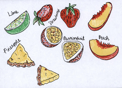
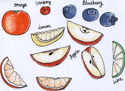
After having been able to find the idea, I've been producing an array of alternate fruit segment and slice drawings with fine-liners and markers which I then will edit into the flower aspects eventually. I looked into what fruit the company actually use in their drinks in order to see what I could effectively illustrate and show how the alternate flavours can be displayed in a more fun way.
Although I have tested a few other physical techniques for the fruit in my sketchbook such as felt and paint, I think that the most effective technique has certainly been the marker and fine liner aspects, as I believe these have more character and offer that raw and natural aspect that I strive for in the animation. It also means that there is more colour and less digital elements involved, allowing me to experiment with a technique I haven't really tried before, with drawing and scanning the elements in.
I have settled for the aspect of such fruit that resembles petals e.g lime, lemon etc. to become the petal aspects on some of the fruit flowers, whereas for the middle part I would include the aspect of blueberries and cranberries for the more circular aspect. Looking at the sketches involved I can see that once discussed with Rick, an aspect of rotation of the slices is important, so I will analyse the alternate slices of fruit and see what they'd look like from different angles in order to animate them successfully.
I could perhaps even analyse real fruit myself, by cutting and slicing some fruit that I have purchased and photographing and drawing from it in that way.

Fruit included in Feel Good Co.'s drinks:

  • Apple
  • Lime
  • Orange
  • Mango
  • Peach
  • Pineapple
  • Passionfruit
  • Lemon
  • Blueberry
  • Cranberry
  • Strawberry
In addition to the simplified fruit sketches, I've produced some actual versions of what the flowers would look like as a whole to ensure that the composition itself actually looks aesthetically pleasing, and to ensure the changes in colour scheme will work well with the design overall.
Original Sketch
Clone Tool Edit with Photoshop, to see what it would look like in vast numbers.


Final Idea

Initial Storyboard Production
Producing an array of compositions and storyboards in my book, I was able to distinguish a final storyboard as an idea to work with, this could be altered as I went along, but think would work best if I made alterations as I needed them. I quite like the drawn out aspect of design for this animation, as I believe it adds to the raw and natural feel that I want to produce. It also references well with the brief wanting it to be a fun and playful advertisement of their range. The aspect of the final design also involving the idea of fruit like flowers also ensures that I have identified with the female target audience of the drinks as well as the health side added towards it.
I think although the whole sequence is of importance, the ending part is as I've noticed in other advertisements that I've studied for research, one of the most important parts.

The Sequence
Scene 1. Blank coloured background, quite dull looking, high contrast drawing of a whole orange on screen, slightly off centre, eye drawn to orange. (Background will change as sequence progresses - enhances fun, playful aspect of the drink)
Scene 2. Apple with leaf shown (whole red apple) enters from right side, rolls onto screen towards the orange still situated in the left, slightly off centre. Slight tinkle of music, perhaps dotted notes to appear to show the appearance of the apple.
Scene 3. Apple continues to roll with some speed, music slightly picking up with the energy of the apple rolling towards the orange.
Scene 4. Apple rolls into the orange, maybe show the orange squashing more than the apple (different consistencies of the orange compared to the apple) Orange is rolled and collides with the end of the screen, almost acting as a wall.
Scene 5. Orange and apple both split into sections on impact of the collision, approx. 4 apple pieces, 3 orange segments. Background shifts in colour when collision occurs, and music drastically picks up. Segments scatter across the screen.
Scene 6. As segments are scattered, a blueberry falls from top of the screen, situating in the centre, and as it does so, the segments are attracted to it like magnets, music coincides with the movements.
Scene 7. Colour background shifts again to an orangey yellow colour, alike that of the Orange and Passionfruit drink tested in survey and taste test as my research. Slices and segments are surrounding the blueberry and resemble a flower. Movement resembles a dance like behaviour, spinning and swirling.
Scene 8. As flower segments and slices rotate slowly around the blueberry, various other fruit flowers appear on screen, acting as if they're bubbles rising up. I'd like the slices to rotate as they rise, so various drawings of slices need to be made.
Scene 9. Flowers carry on 'dancing' as camera zooms out to reveal more and more of the flower type bubbles dancing also.
Scene 10. Again, camera is zooming out and slowly reveals the fact that it is actually fruit like bubbles inside the Orange & Passionfruit bottle which will be a photographic element added in.
Scene 11. Camera pans out to reveal a photograph of a few of the products in the range and decorated with a border of fruit like flowers.